Average age in the dataset.
Artificial Intelligence Assignment 01
Exploring the
Heart UCI dataset.
A compact exploratory data analysis built with Python. This report inspects the dataset, summarizes its numerical features, and visualizes age, maximum heart rate, and cholesterol across the target groups.
303patient records
14dataset columns
0missing values
4visualizations
02 / Data preview
Load and inspect the data
The CSV is loaded directly from its public GitHub source. Viewing the first ten rows confirms the column names and the kind of values stored in each feature.
import pandas as pd

url = "https://raw.githubusercontent.com/sharmaroshan/Heart-UCI-Dataset/master/heart.csv"

data = pd.read_csv(url)  # Load the CSV into a Pandas DataFrame.
data.head(n=10)       # Display the first ten patient records.
Output
DataFrame
First 10 rows
| # | age | sex | cp | trestbps | chol | fbs | restecg | thalach | exang | oldpeak | slope | ca | thal | target |
|---|---|---|---|---|---|---|---|---|---|---|---|---|---|---|
| 0 | 63 | 1 | 3 | 145 | 233 | 1 | 0 | 150 | 0 | 2.3 | 0 | 0 | 1 | 1 |
| 1 | 37 | 1 | 2 | 130 | 250 | 0 | 1 | 187 | 0 | 3.5 | 0 | 0 | 2 | 1 |
| 2 | 41 | 0 | 1 | 130 | 204 | 0 | 0 | 172 | 0 | 1.4 | 2 | 0 | 2 | 1 |
| 3 | 56 | 1 | 1 | 120 | 236 | 0 | 1 | 178 | 0 | 0.8 | 2 | 0 | 2 | 1 |
| 4 | 57 | 0 | 0 | 120 | 354 | 0 | 1 | 163 | 1 | 0.6 | 2 | 0 | 2 | 1 |
| 5 | 57 | 1 | 0 | 140 | 192 | 0 | 1 | 148 | 0 | 0.4 | 1 | 0 | 1 | 1 |
| 6 | 56 | 0 | 1 | 140 | 294 | 0 | 0 | 153 | 0 | 1.3 | 1 | 0 | 2 | 1 |
| 7 | 44 | 1 | 1 | 120 | 263 | 0 | 1 | 173 | 0 | 0.0 | 2 | 0 | 3 | 1 |
| 8 | 52 | 1 | 2 | 172 | 199 | 1 | 1 | 162 | 0 | 0.5 | 2 | 0 | 3 | 1 |
| 9 | 57 | 1 | 2 | 150 | 168 | 0 | 1 | 174 | 0 | 1.6 | 2 | 0 | 2 | 1 |
03 / Structure
Check shape and data types
Before plotting, the dataset structure is checked for dimensions, data types, and completeness. This guards against silent errors later in the analysis.
data.shape  # Return (rows, columns).

data.info() # Show data types and non-null counts.Rows303
×
Columns14
Output · data.info()0 missing
<class 'pandas.core.frame.DataFrame'>
RangeIndex: 303 entries, 0 to 302
Data columns (total 14 columns):

 #   Column     Non-Null   Dtype
 0   age        303        int64
 1   sex        303        int64
 2   cp         303        int64
 3   trestbps   303        int64
 4   chol       303        int64
 5   fbs        303        int64
 6   restecg    303        int64
 7   thalach    303        int64
 8   exang      303        int64
 9   oldpeak    303        float64
10   slope      303        int64
11   ca         303        int64
12   thal       303        int64
13   target     303        int64

dtypes: float64(1), int64(13)
04 / Statistics
Describe the numerical features
describe() gives the count, center, spread, and range of every numerical
column. The complete output is preserved below.
data.describe() # Summarize every numerical column.Output
Rounded to 2 decimals
Descriptive statistics
| age | sex | cp | trestbps | chol | fbs | restecg | thalach | exang | oldpeak | slope | ca | thal | target | |
|---|---|---|---|---|---|---|---|---|---|---|---|---|---|---|
| count | 303.00 | 303.00 | 303.00 | 303.00 | 303.00 | 303.00 | 303.00 | 303.00 | 303.00 | 303.00 | 303.00 | 303.00 | 303.00 | 303.00 |
| mean | 54.37 | 0.68 | 0.97 | 131.62 | 246.26 | 0.15 | 0.53 | 149.65 | 0.33 | 1.04 | 1.40 | 0.73 | 2.31 | 0.54 |
| std | 9.08 | 0.47 | 1.03 | 17.54 | 51.83 | 0.36 | 0.53 | 22.91 | 0.47 | 1.16 | 0.62 | 1.02 | 0.61 | 0.50 |
| min | 29.00 | 0.00 | 0.00 | 94.00 | 126.00 | 0.00 | 0.00 | 71.00 | 0.00 | 0.00 | 0.00 | 0.00 | 0.00 | 0.00 |
| 25% | 47.50 | 0.00 | 0.00 | 120.00 | 211.00 | 0.00 | 0.00 | 133.50 | 0.00 | 0.00 | 1.00 | 0.00 | 2.00 | 0.00 |
| 50% | 55.00 | 1.00 | 1.00 | 130.00 | 240.00 | 0.00 | 1.00 | 153.00 | 0.00 | 0.80 | 1.00 | 0.00 | 2.00 | 1.00 |
| 75% | 61.00 | 1.00 | 2.00 | 140.00 | 274.50 | 0.00 | 1.00 | 166.00 | 1.00 | 1.60 | 2.00 | 1.00 | 3.00 | 1.00 |
| max | 77.00 | 1.00 | 3.00 | 200.00 | 564.00 | 1.00 | 2.00 | 202.00 | 1.00 | 6.20 | 2.00 | 4.00 | 3.00 | 1.00 |
Average maximum heart rate.
Average cholesterol value.
05 / Visualization 01
Age distribution
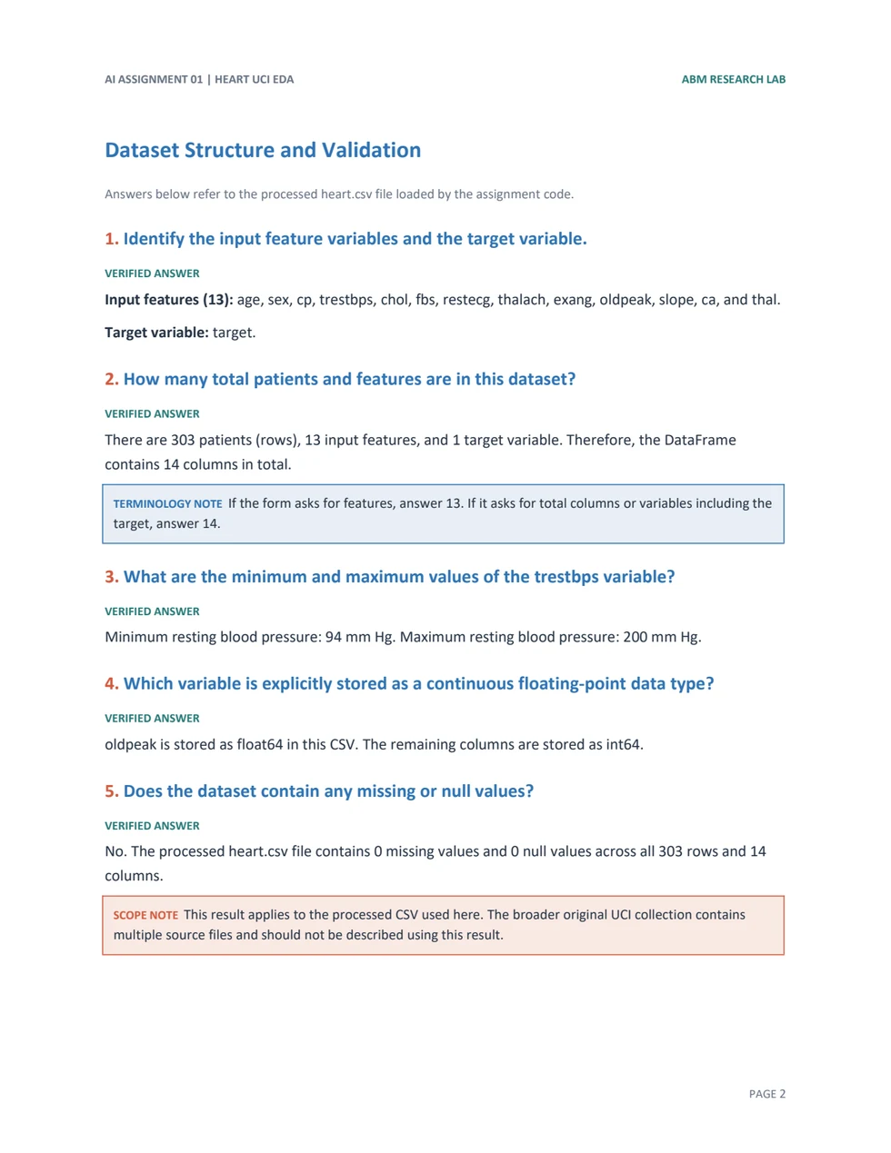
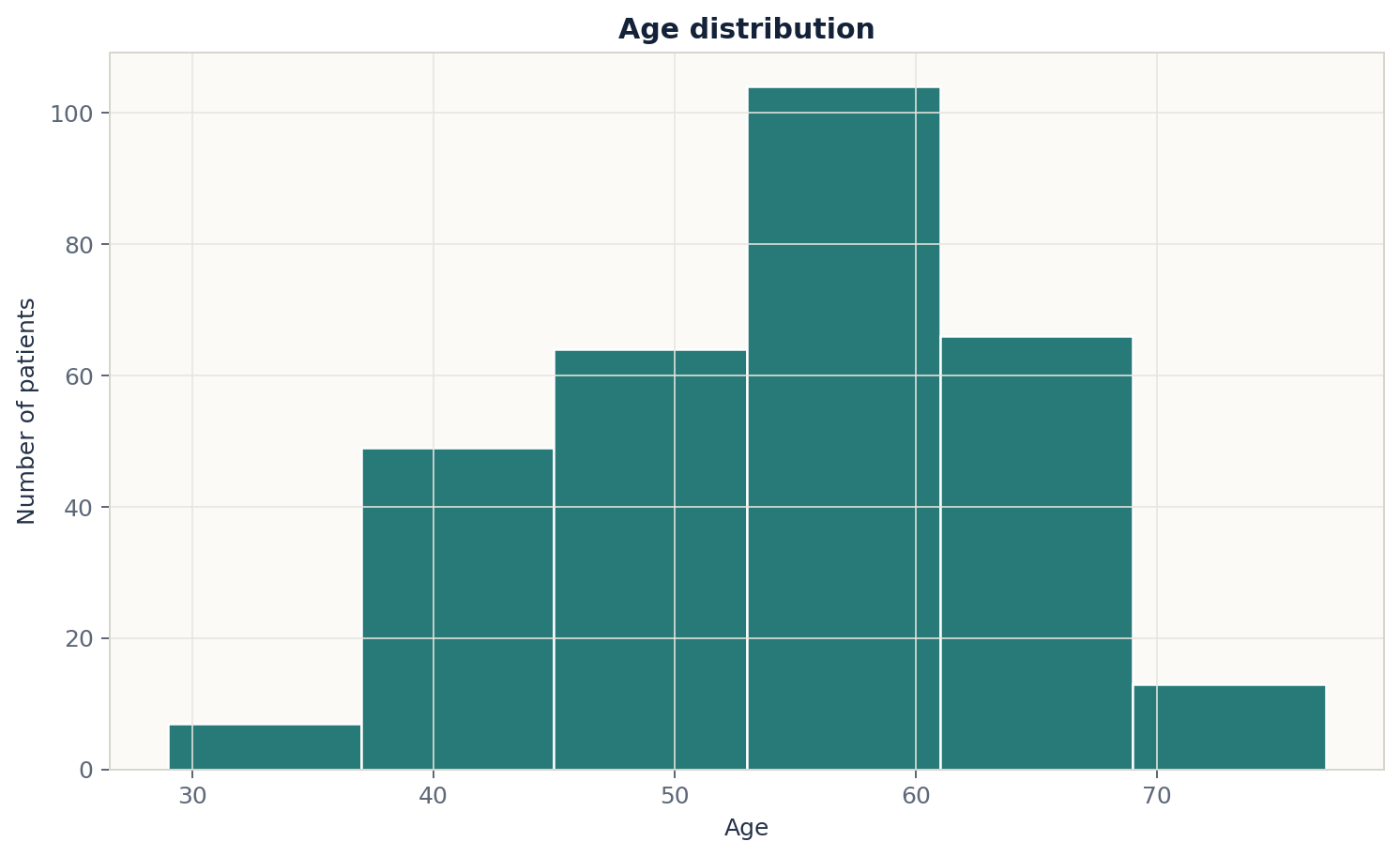
A histogram groups the 303 ages into six equal-width intervals to reveal where most observations fall.
import matplotlib.pyplot as plt

data["age"].hist(
    bins=6,
    color="#277a78",
    edgecolor="white"
)
plt.xlabel("Age")
plt.ylabel("Number of patients")
plt.title("Age distribution")
plt.show()

# Most patients are between
# 53 and 61 years old.Figure 01Histogram · 6 bins
06 / Visualization 02
Maximum heart rate by target
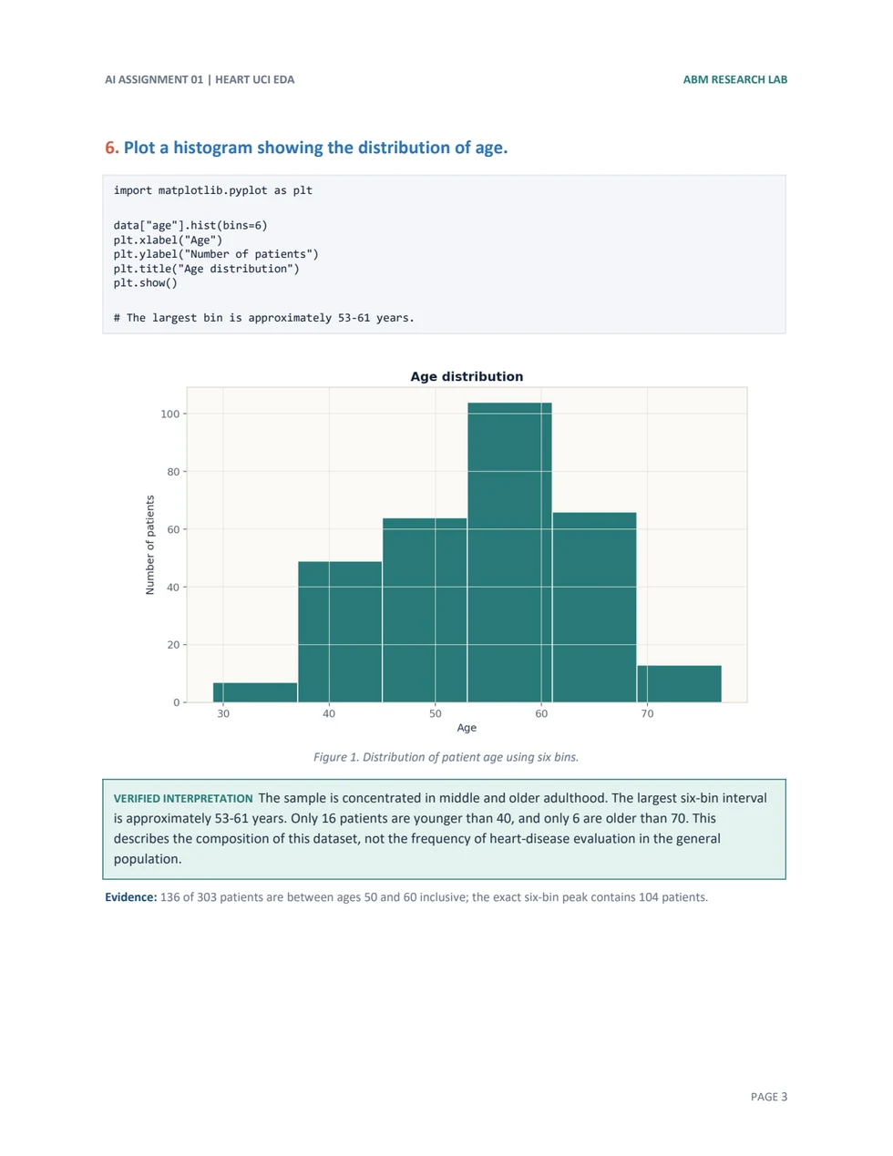
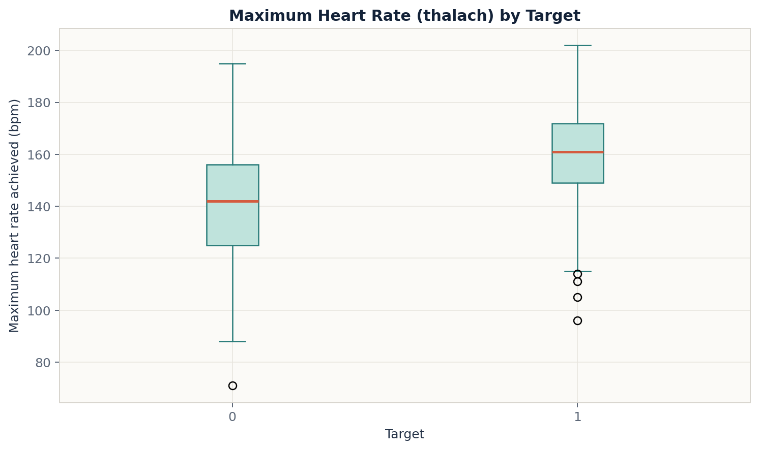
The box plot compares the center, spread, and possible outliers of thalach for Target 0 and Target 1.
Figure 02Box plot · thalach
data.boxplot(
    column="thalach",
    by="target"
)
plt.xlabel("Target")
plt.ylabel(
    "Maximum heart rate achieved (bpm)"
)
plt.title(
    "Maximum Heart Rate (thalach) by Target"
)
plt.suptitle("")  # Remove default text.
plt.show()

# Target 1 has a higher median
# thalach than Target 0.07 / Visualization 03
Age vs. maximum heart rate
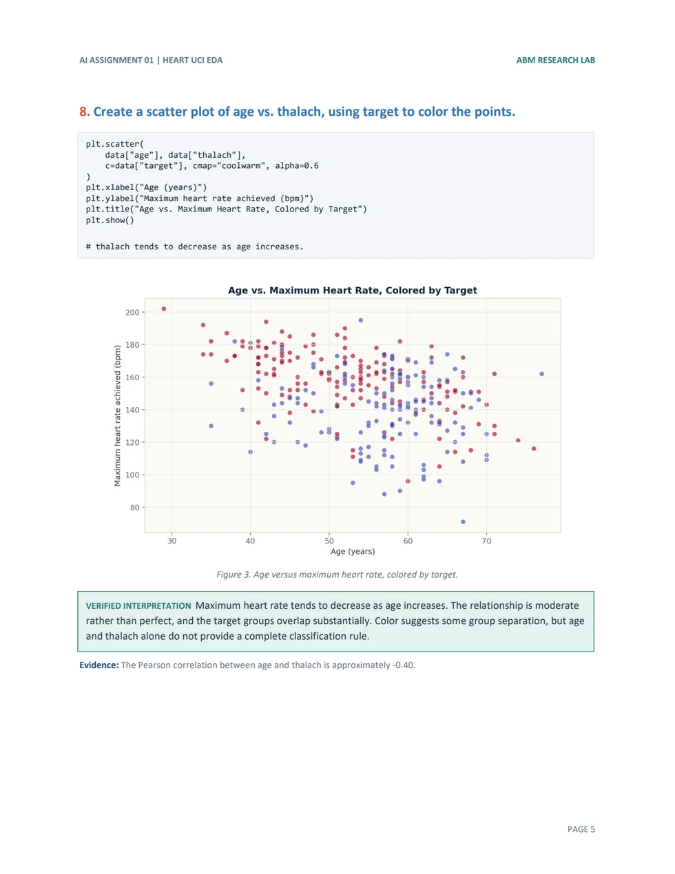
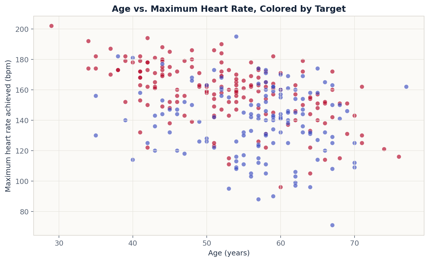
Each point represents one patient. Color separates the target groups and exposes how the two variables move together.
plt.scatter(
    data["age"],
    data["thalach"],
    c=data["target"],
    cmap="coolwarm",
    alpha=0.6
)
plt.xlabel("Age (years)")
plt.ylabel(
    "Maximum heart rate achieved (bpm)"
)
plt.title(
    "Age vs. Maximum Heart Rate, Colored by Target"
)
plt.show()

# Maximum heart rate tends to
# decrease as age increases.Figure 03Scatter · colored by target
Target 0Target 1
08 / Visualization 04
Cholesterol by target
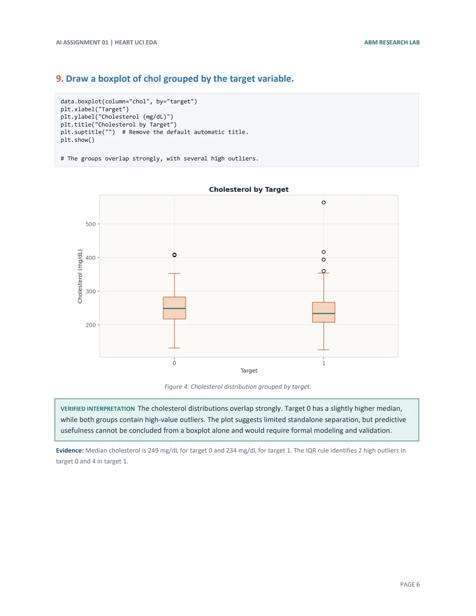
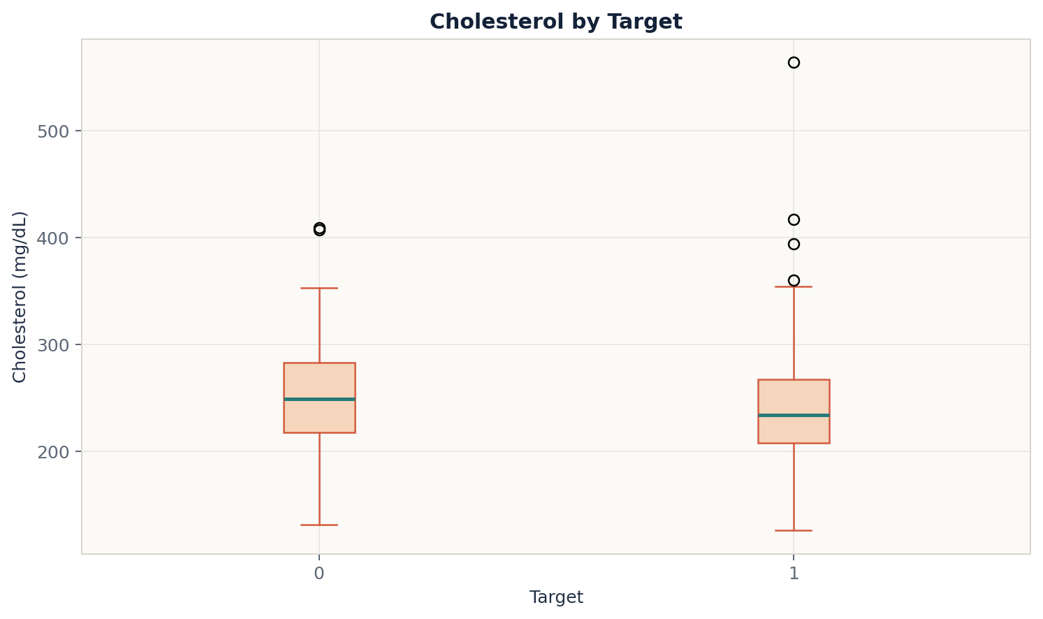
The final box plot adds the cholesterol analysis and uses the same target-group comparison as the heart-rate plot.
Figure 04Box plot · cholesterol
data.boxplot(
    column="chol",
    by="target"
)
plt.xlabel("Target")
plt.ylabel("Cholesterol (mg/dL)")
plt.title("Cholesterol by Target")
plt.suptitle("")  # Remove default text.
plt.show()

# The groups overlap strongly;
# Target 0 has a slightly higher median.Conclusion
What the exploration shows
In this sample, Target 1 has a higher median maximum heart rate, while cholesterol values overlap strongly between the two groups. Age and maximum heart rate show a moderate negative relationship. These charts describe patterns in the sample; they do not establish medical causation.